UX/UI DESIGN • LANDING PAGE
FlavorFusion
Landing page for a mobile recipe app
Role & Team
UX/UI Designer
Task
End-to-End design process:
from problem to high-fidelity prototype of a landing page (UX Research, UI Design, Prototyping)
Timeline & Context
June 2025
20-hour Design Sprint supported by generative AI in the UX/UI Bootcamp at neuefische
Tools
Figma, FigJam, Notion,
ChatGPT, Gemini
The Challenge
Ambitious home cooks face a frustrating choice: either they fight their way through overloaded recipe apps – or they give up on real inspiration entirely. What's missing is an intuitive, emotionally engaging landing page that creates a personal connection, builds trust, and makes downloading the FlavorFusion app feel like the obvious next step – so they can finally use a truly great recipe app.
Research Highlights
Users Feel Overwhelmed
Unclear call-to-actions and overloaded information cause users to drop off quickly.
Emotion Creates Connection
Users don't want a plain recipe list – they want emotional stories and inspiration.
Trust Through Preview
Users look for ratings and previews to build trust.
COOK 3–5x PER WEEK
USE APPS INSTEAD OF GOOGLE
WANT CLEAR STEP-BY-STEP GUIDES
LOOK FOR BEAUTIFUL PHOTOS & INSPIRATION
"Recipes should look beautiful and inspire me – not just work."
How might users be guided through the landing page in a way that feels clear, beautiful and inspiring, so they immediately build trust and downloading the app becomes the most natural next step?
Process
Authenticity
The landing page feels like a great kitchen tip from a friend – warm, authentic and real.
Clarity
Like a great recipe: a clear roadmap with effortless orientation and intuitive guidance.
Passion
Food is emotional – the landing page sparks joy of cooking through inspiring content and thoughtful details.
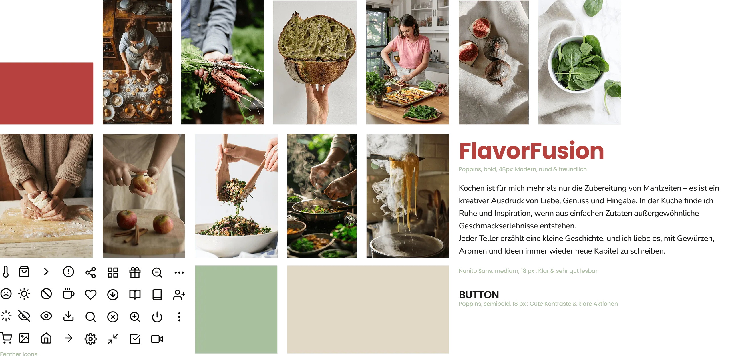
UI Foundation
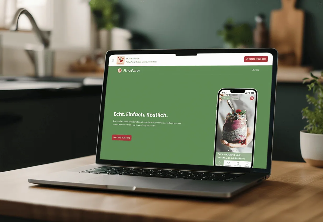
Final Design
The finished landing page in action – warm, inviting and intuitively designed. With clear navigation, beautiful recipe photos and the feeling that you want to start cooking right away.
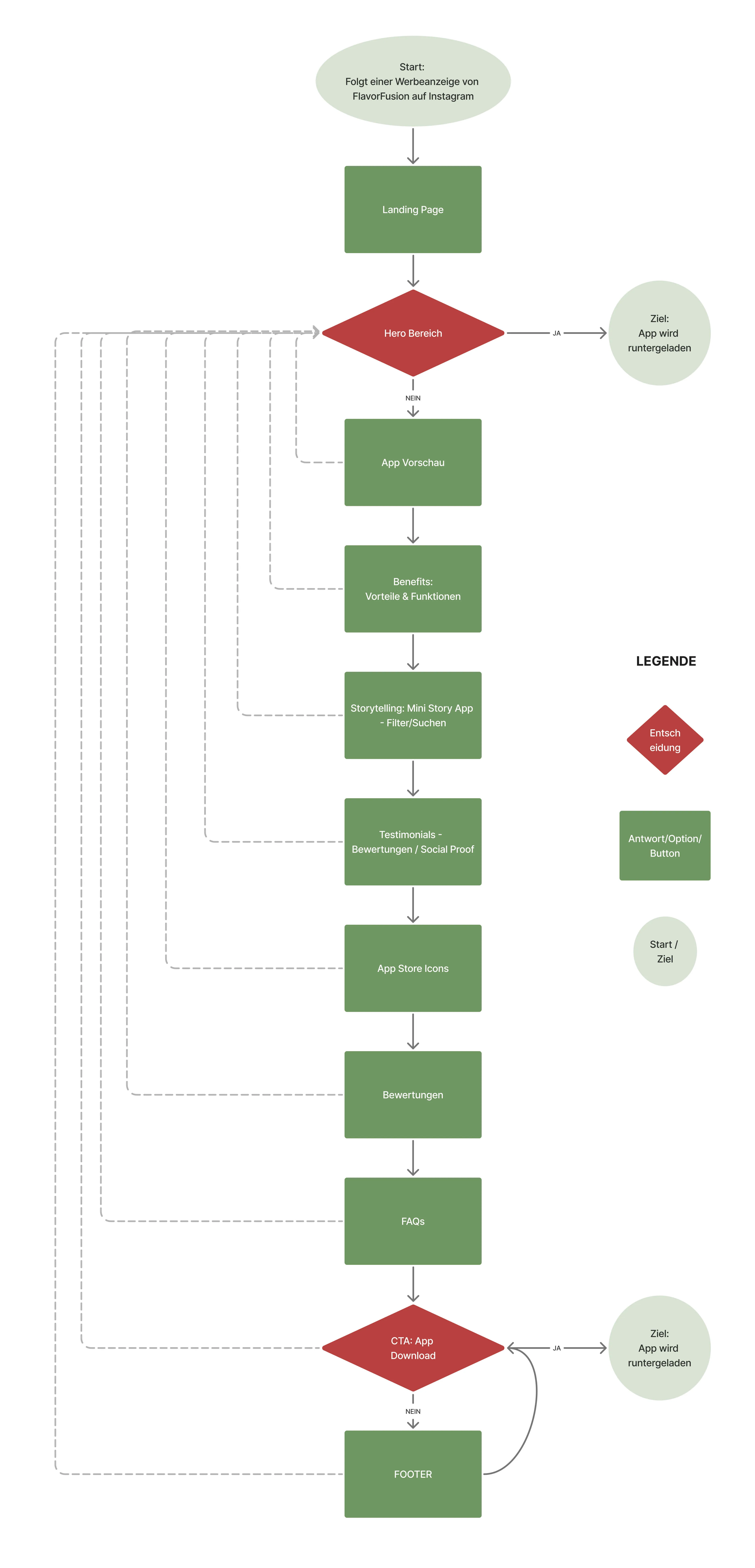
The video shows the complete scroll experience of the landing page:
from the first encounter with the hero all the way to the end – with all its inspiring details and the emotional recipe world.
Results & Learnings
In just 20 hours, a strategic Minimum Viable Product was created. The landing page is clear, emotionally engaging and drives users straight to conversion.
Radical Prioritisation
The 20-hour design sprint served as a catalyst for a radical focus on the core message and the central action of the landing page.
Research as Foundation
AI can simplify and accelerate a thorough and well-founded user research process – but it can't replace it entirely.
Courage to Decide
The tight timeline showed how crucial the courage to make quick decisions is – without losing the empathetic perspective.
NEXT STEPS
- → Test: Validate the prototype with real users
- → Iterate: Use feedback to make targeted improvements
- → Build & Optimise: Launch the final page and increase conversion through A/B testing